

The single most important rule in billboard design: a driver decides whether your message registers almost instantly with only a few seconds to view it, so every board needs one idea, one bold visual, oversized legible type, high contrast, and exactly one call to action. Everything else, from font weight to file format, exists to protect that one rule. Industry best practices and a preflight checklist can help you execute it, but the rule itself never changes.
TL;DR:
- Keep billboard copy to seven words or fewer to ensure quick comprehension within the three-second viewing window.
- Use one clear message, one visual, and one call to action to maximize recall and avoid clutter.
- Prioritize high contrast, bold sans-serif fonts, and short line lengths for optimal highway readability.
- Design around a single large, cropped image with a prominent logo, following a strict visual hierarchy.
- Confirm file specs, test designs at small scale, and consider environmental and cultural factors before finalizing.
Table of Contents
- Core Billboard Design Guidelines Every Designer Should Follow
- Typography Rules for Type That Reads at Highway Speed
- Building Visual Hierarchy That Reads in a Glance
- Matching Copy and Calls to Action to Your Campaign Goal
- Technical Specs to Confirm Before You Send Files to the Vendor
- Testing Your Design Before Submission
- Environmental and Cultural Sensitivity Guidelines
- Trends Shaping Billboard Design
- How These Rules Play Out in Real Local Campaigns
- Get Your Billboard Campaign Off the Ground
- Authoritative Resources for Billboard Design
- Sources
Core Billboard Design Guidelines Every Designer Should Follow
Billboard design guidelines exist because drivers do not read, they glance. Build every board around that reality, and the rest of the work is just discipline.
- Follow the 3-second rule. Keep copy to seven words or fewer, a benchmark Adobe and Lamar both recommend for large-format clarity.
- Say one thing. One message, one visual, one call to action. A board trying to announce a sale, a new location, and a phone number accomplishes none of the three.
- Give the design room to breathe. Negative space is not wasted space. It is what makes the headline pop instead of drowning in clutter.
- Push contrast hard. Dark type on a light field, or the reverse, reads faster than any clever color pairing.
- Break the rules only on purpose. Some campaigns intentionally use a puzzle-style board or an unusual crop to spark social sharing. That works only when the brand can absorb a lower immediate read rate in exchange for buzz, and only when the strategy is deliberate, not accidental clutter.
Industry recall studies back this up directly: analyses of billboard performance consistently show recall drops as the number of visual concepts on a board increases. Simpler boards, not busier ones, stick in memory.
Pro Tip: Print your layout at business-card size and glance at it for one second from arm’s length. If you can’t tell what it’s selling, neither can a driver doing 45 miles per hour.
Typography Rules for Type That Reads at Highway Speed
Font choice is not a style decision on a billboard. It is a legibility decision first, and a brand decision second.
- Choose bold, geometric sans-serif families. Avoid scripts, thin weights, and anything with delicate serifs that blur at distance.
- Apply an inch-to-distance sizing guideline: the farther the viewing distance, the taller your letters need to be, and headlines should dominate the board rather than compete with subheads.
- Keep line lengths short and letterspacing generous. Cramped tracking is one of the fastest ways to kill legibility on a moving board.
- Favor mixed case over ALL CAPS for longer phrases. All caps works for a short punchy word or two, but it slows reading on anything longer.
- Check every color pairing against color blindness. Red and green together are a common failure point.
High contrast is not a nice-to-have. Several industry sources tied to Lamar’s design guidance put the recall improvement from strong contrast treatments in the range of 30 to 40 percent over low-contrast layouts. That is the difference between a board people remember and one that blurs into the roadside.
Building Visual Hierarchy That Reads in a Glance
A billboard has room for one dominant visual, not a gallery. Structure it around a single image large enough to register instantly, and never build a design that pins text over a busy photo collage. Visual hierarchy means the eye has exactly one path: image, headline, logo, in that order.
- Choose one strong image and crop it tight. A close, simple shot outperforms a wide, detailed scene.
- Place your logo where it confirms the brand without competing with the headline for attention.
- Consider environmental extensions (a board that appears to spill past its frame) when the budget and site support it, since these shift composition rules toward the physical structure itself.
- On digital boards, keep brightness calibrated to daylight versus nighttime settings and favor calm, slow motion. Frantic animation near traffic often violates operator rules and rarely helps recall, a point digital design guidance makes clearly.
- Build time-of-day or weather variants only if each variant keeps the same one-idea discipline as the primary design.
Treating the image as the headline, and the headline as a caption, is a technique borrowed from visual storytelling best practices, where a single strong frame carries more weight than any amount of supporting copy.
Matching Copy and Calls to Action to Your Campaign Goal
The right call to action depends entirely on what the board is supposed to accomplish, not on what sounds clever in a creative meeting.
- Lead headlines with verbs and a sense of immediacy. “Get 20% Off Today” beats a vague brand statement almost every time.
- Driving foot traffic to a nearby location calls for a directional CTA: an arrow, “Next Exit,” or a street name.
- Building brand awareness calls for a short, memorable tagline with no CTA pressure at all.
- Skip long phone numbers and full URLs. A short domain or a simple directional phrase reads faster and sticks longer.
- Use QR codes on pedestrian-facing boards where someone has time to stop and scan, but never make one the primary CTA on a highway board where nobody can safely engage with a phone.
Technical Specs to Confirm Before You Send Files to the Vendor
Every design rule above falls apart if the file itself does not survive production. Confirm specs with the media owner before you build final art, not after.
- Deliver in vendor-preferred formats: PDF/X for print-ready files, TIFF for raster elements, and vector source files (AI or EPS) for logos and type wherever possible.
- Vector assets scale cleanly to any size without the blur that raster art picks up when blown up to billboard dimensions.
- Confirm resolution requirements and safe margins or bleed zones for your specific structure. These vary by vendor and by board size.
- Set up color profiles for print proofing, and remember that digital boards render brighter and more saturated than print, so a color that looks right on your monitor may run hot on an LED face.
- Lock these specs early. Reworking a file after a vendor rejection costs both time and a media slot you may not get back.
Testing Your Design Before Submission
A board that looks great on a laptop screen can fail completely at highway speed. Test before you submit, not after the vendor prints it.
- Run the shrink test. Print your design at business-card size and view it from across the room.
- Use the OAAA mockup generator to preview the creative in a simulated street context at multiple viewing distances.
- Check Street View mockups for the actual site if the board is already placed in a known location.
- Run the self-test: can someone read the message in three seconds, is there exactly one CTA, and does the contrast hold up at a glance?
- Copy this preflight list into your creative brief so nothing gets missed before files ship.
The OAAA’s best-practices guidance exists precisely because catching a legibility problem at the mockup stage is far cheaper than catching it after a board goes up.
Pro Tip: Step back from your screen until the design blurs slightly. If the headline is still readable, it will probably survive the highway.
Environmental and Cultural Sensitivity Guidelines
Billboard placement is not just a design question. It is a site and community question, and getting it wrong costs more than a rejected file.
Consider the physical environment first. A board near a school, hospital, or residential corridor carries different content expectations than one on an industrial highway stretch, and many jurisdictions restrict certain product categories (alcohol, tobacco, gambling) near sensitive sites. Lighting also matters environmentally: digital boards near residential areas often face brightness and curfew restrictions that a rural highway placement would never encounter.
Cultural context matters just as much as the physical site. Imagery, slang, and humor that land well in one neighborhood can misfire badly in another, particularly in markets with strong regional identity or a specific cultural or linguistic makeup. A tagline that reads as playful in one community can read as tone-deaf a few miles away. Before finalizing creative for a new market, review the surrounding signage, the dominant languages spoken locally, and any community sensitivities tied to the site’s history.
Seasonal and environmental timing deserves a look too. A board celebrating a local festival, sports season, or civic event connects with a community; the same board running six months after the event feels careless. None of this replaces the core design discipline, but it decides whether a technically perfect board actually resonates.
Trends Shaping Billboard Design
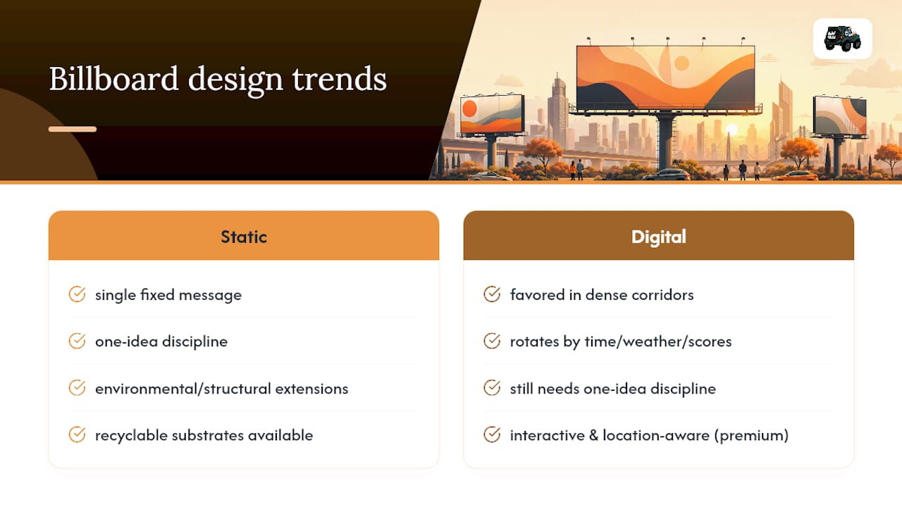
Static vs digital billboard choices increasingly favor digital placements in dense corridors, and that shift is reshaping design habits across the category. Digital boards let brands rotate creative by time of day, weather, or even local sports scores, but the strongest campaigns still hold to the same one-idea discipline as static boards. A digital face running five different messages in rotation is not five wins, it is five chances to be forgotten.
Bold minimalism keeps gaining ground. Brands are stripping boards down to a wordmark, a single color field, and almost no supporting copy, betting that restraint reads as confidence. Interactive and location-aware creative, tied to nearby weather or traffic conditions, is showing up more often on premium digital inventory, though it demands tighter creative-ops coordination to keep every variant on-message.
Environmental and structural extensions, where a board’s creative appears to break past its physical frame, remain a favorite for brands chasing social shares rather than pure recall. Sustainability is also entering the conversation, with more vendors offering solar-powered digital faces and recyclable substrates for static boards, giving brands a genuine story to tell alongside the ad itself.
How These Rules Play Out in Real Local Campaigns
The one-message rule sounds simple until a client wants their logo, tagline, phone number, and a seasonal promo on the same board. Part of running local campaigns well is having the conversation early: pick the single job that board needs to do, and build every other decision around it. That discipline is why the billboards that work hardest for a business rarely feel crowded.
If you want to see how outdoor spend compares against other local channels, our billboard ROI breakdown walks through how to measure what a board actually returns. For teams adapting a highway concept into print, the print advertising guide for professional services covers how the same one-message thinking translates to a smaller format. Once your creative is ready, the smartest next step is getting a second set of eyes on it before it ships to a vendor.
— Mike
Get Your Billboard Campaign Off the Ground
Work with a knowledgeable team to avoid the challenges of managing vendor specs and site selection alone. Coordinated handling of design refinement, board placement, and performance measurement helps prevent costly errors in media placements.
We build creative around the one-message rule outlined above, then match it to sites and traffic patterns that fit your goal, whether that’s foot traffic, brand recall, or a regional push. Our local advertising best practices guide breaks down how billboard placement fits into a broader local media plan, and our media planning checklist is a useful next step if you’re briefing a vendor for the first time. Ready to get specs and pricing for your market? Request a campaign audit and we’ll map out what a billboard placement looks like for your business.
Authoritative Resources for Billboard Design
- OAAA best-practices guide (PDF) and the OAAA mockup generator
- Adobe’s billboard design guidance
- Lamar’s design tips
- Common mistakes advertisers make in large-format creative
Sources
- OAAA best-practices (PDF)
- Create billboard designs that demand attention. — Adobe
- Design Tips — Lamar